A Bit of Context
More than half of all Domino’s orders are made on mobile devices, and it’s a trend that is not slowing down. Web and mobile orders drive the business for a variety of reasons, including convenience, anonymity, and coupons; but, there is also the secret weapon of the Domino’s Pizza Profile (account) that really gets pizza eaters coming back for more.
Putting the Pizza Profile & Easy Order to Work
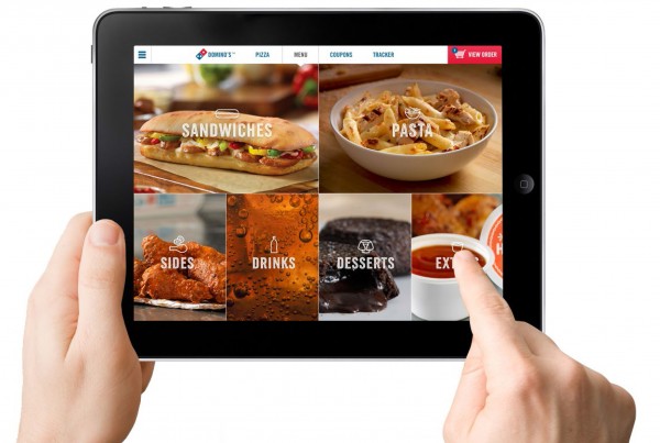
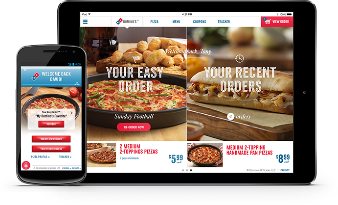
When a user creates their Pizza Profile, they are able to save their payment methods, addresses, favorite orders and more to make ordering in the future faster and easier than ever. The best realization of the profile so far comes in the shape of the “Easy Order” — an order that you’ve set as your favorite, with all payment and address details attached — that places your order with just a tap from your profile and is delivered to you and paid for automatically.

What Comes Next?
Looking for more ways to leverage the “Easy Order” and not content with just web and mobile ordering, we began searching for unexpected, yet convenient and fun ordering options. An early example was my design for the Pebble watch — an early foray into the smart watch market — which was soon followed by an Android wear and Apple watch application.

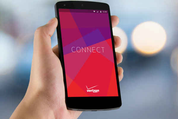
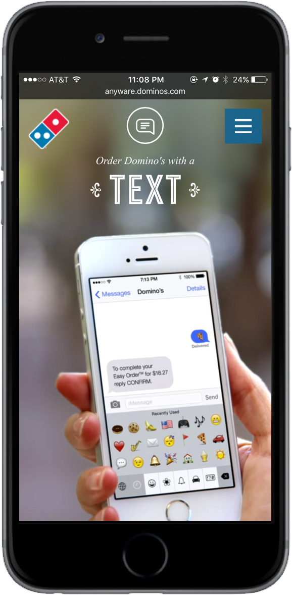
 Order Your Favorite With Just A Text
While all of the extensions have found different levels of success, nothing quite reaches the popularity and press that the “Text a pizza emoji” has garnered. Written up in dozens of major publications, the specific extension went on to win the most coveted prize in advertising, the Cannes Titanium Grand Prix.
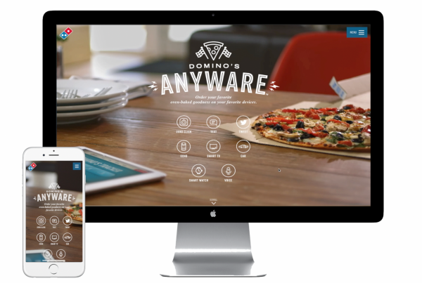
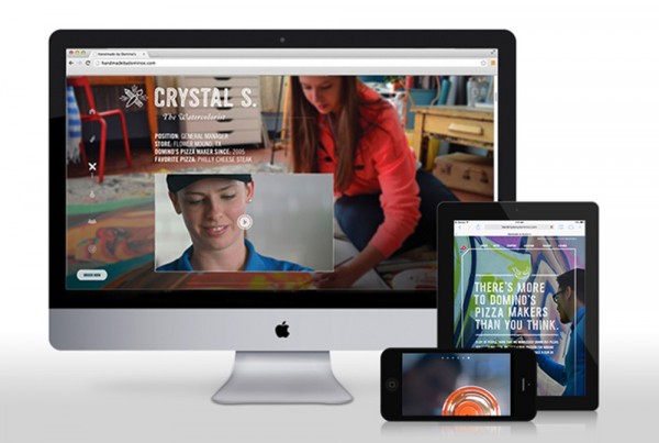
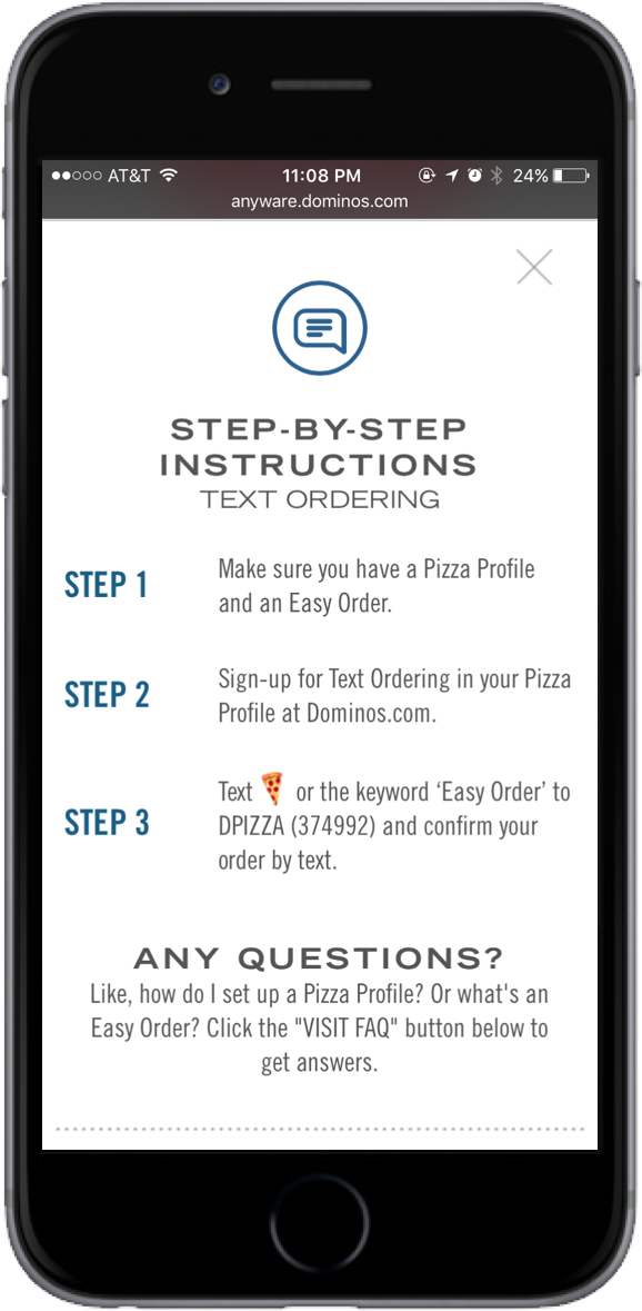
As the experience designer for the project, I worked with our technologist and small team at CP+B to develop how this service could be implemented and rolled out to consumers. Some of the key steps included evolving the profile and creating clear set-up procedures for users looking to try out the service. Part of that introduction for users was creating the website Domino’s Anyware which hosted not only the numerous extensions, but their set-up procedures as well.

Design & Craft for Responsive Web
For the Anyware website, our goal was to build a site that showcased the numerous extensions while still providing a very clear value add. Myself, a visual designer, and a technologist gathered around a whiteboard and sketched out multiple iterations of what this site could be. Much of our early discussion was focused on what the intention of users visiting the site was, and how we could introduce them to all the different extensions in an easily digestible way. After much discussion, we settled on displaying short vignettes of each of the products being used to place orders.
The short vignettes did two things for us: first, it gave an actual “live” demo of each of the products which lessened the burden of text heavy explanations, and second, it provided rich and compelling imagery to garner attention and maintain the interest of visiting users. It was my responsibility to figure out how the site actually came together and told the story we were hoping to tell, while providing the necessary content and steps to drive users to sign up for the extensions. We opted for a responsive website to make the experience consistent as well as accessible for our very digitally savvy audience. The website is still growing, and while more extensions are being added, I no longer am contributing as I have since left CP+B but I am still looking forward to see what comes next.
CREDITS
Company
Crispin Porter + Bogusky
Responsibilities
User Experience Design
Date
September 2014